When Laurie met Antoni by Justin Fuqua

The work of Antoni Gaudi evokes a love/hate relationship with most people; they either love or hate it.  However you feel about Gaudi, he was ahead of his time and worked miracles with the technology available at the time. 

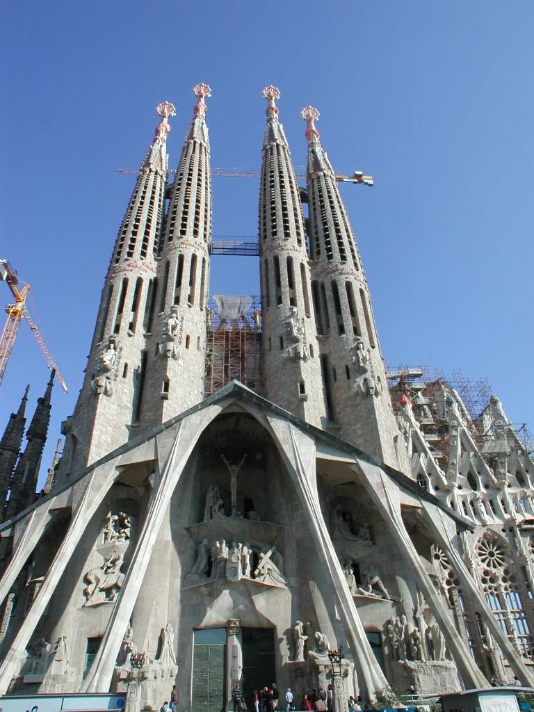
Sagrada Familia by Gaudi

Sagrada Familia by Gaudi

Gaudi was a prolific Spanish Architect who practiced Catalan Modernism in and around Barcelona, Spain.  Perhaps his most famous work is Sagrada Familia, the largest unfinished Roman Catholic Church in the world.  Some of you may remember it as a featured icon during the 1992 Summer Olympics that took place in Barcelona.  Although construction began in 1882, building continues to this day and completion is anticipated to be in 2026. 

Hopefully the Vista Residence won’t take so long.

Laurie is a client of mine who has been a great fan of Gaudi’s works for many years.  She approached me with an unusual request: design a contemporary home on a hillside in Vista, California patterned after the architecture of Antoni Gaudi. 

Okay – sounds simple enough.  Piece of cake…not!

Proposed Floor Plan

Proposed Floor Plan

Aside from the Gaudi thing, the Owner requested a few things to be incorporated into the design.  These include a Great Room, large Kitchen and Dining Room, an unusual Master Bedroom and Bathroom, a separate office space and two remote Guest Bedrooms, all of which are to surround a large interior shaded courtyard.  The central courtyard will also contain a bridge with a fairly large koi pond that will be used to provide passive cooling during the hot summer months. 

Fortunately, Laurie’s site is large enough to set the structure away from the street and supplement it with some interesting landscaping.  It will support a small orchard, with some of the trees bleeding into the central courtyard and strategically placed planters.  The floor plan was “married” to the site after reviewing several determinants including climate, sun angles and views. 

                  Southeast exterior elevation

                  Southeast exterior elevation

Partial floor plan at Foyer/Great Room   

Partial floor plan at Foyer/Great Room   

Over the course of a couple of weeks I played with the placement of various rooms and spaces along with their adjacencies to other functions to make sure the plan was functional as well as playful.  The entrance is very informal and is combined with a floating wall that separates the dining space with interesting views of the central courtyard beyond.  The foyer leads to the kitchen separated by a series of thick arches on one side, and the large circular great room on the other.  The great room offers spectacular views of the California sunsets and has direct access to the front play area that is adjacent to the main entrance to the house. 

From the dining area you enter the loggia, which is basically a sinuous window wall system on the north side that looks out onto the central courtyard.  Four large folding doors open to allow the cool air to enter the house and provide direct access to the courtyard.  Since the courtyard is relatively bug free, these doors can remain open during the summer months.

                                         &nb…

                                              Northeast exterior elevation                

Playroom at east end of loggia                                             Terminus at southwest end of loggia

Playroom at east end of loggia                                             Terminus at southwest end of loggia

Towards the east end of the loggia I placed a playroom/bedroom with access to the kitchen and the orchard to the northeast.  The playroom may also be accessed from the bedroom wing from inside the courtyard.  On the west end of the loggia I provided a half bath and access to the private office and master bedroom suite. The views from the west end of the loggia are framed by a curvilinear window wall system within the confines of a cozy spatial composition.  

                  Southwest exterior elevation

                  Southwest exterior elevation

The office, master bedroom suite and bedroom can be accessed from the loggia by either ramp or stairway.  They sit about 4.5’ higher than the rest of the house, which basically follows the slope of the site.  The round private office will support up to three people and shares a two-way fireplace with the master bedroom.  The master bedroom is oriented in such a manner to provide spectacular views of the sunset while lying in bed. 

Master bedroom suite

Master bedroom suite

Behind the partial-height headboard is the master bathroom.  The focal point in this space is a glass block nautilus composed of layer upon layer of colored glass block.  I placed the shower and wc within the confines of this enclosure to provide privacy.  Outside the nautilus I located the master closet for both long and short time storage.  Immediately to the west of the master suite is an indoor spa that has access to an observation deck that looks out towards the west.  A series of sliding glass doors separate the spa from the deck and can be in the open position when desired.  The deck can also has direct access from the private office.

antoni-laurie-11.png

Laurie wanted the bedroom wing to be separate from the rest of the house and also have access to the courtyard.  These bedrooms are separated from the master bathroom by a utility room that serves all areas.  The bedrooms themselves replicate one another and contain their own separate bathrooms and walk-in closets. 

One of the precepts in the design was to provide an interesting and ever-changing composition wherever you walk in and around the house.  Every hallway for example will have a different focal point, and the way the light enters a space will create an interesting palette as it transforms throughout the days and seasons of the year. 

Northwest exterior elevation

Northwest exterior elevation

Guest House floor plan    

Guest House floor plan    

Laurie wanted a small guest house for use by friends and family.  This space needed to be a bit special, as her Father would be living in it for a season and she wanted the space to match the quality of the main residence.  Since the views were spectacular from this location, I placed the Kitchen and Living Space along the front elevation.  This space has a tall, sculptural torsion ceiling with exposed random-size wooden slats.  An exterior trellis system mitigates the summer sun on the two exposed side.

There is a shared 2-way fireplace between the living Space and the Bedroom.  Since this is an open plan, the same curved ceiling is exposed throughout.  The end result is a physically small space that feels much larger than it really is.  

Above all I want the experience of living in this unusual house to be a joyful one for Laurie and her family.  Not sure if it would receive a blessing from Antoni Gaudi.  But my client Laurie loves it, and that’s all that matters to me.


Richard Emerson Kaufman is an Architect/Chief Visionary Officer of The Kaufman Collaborative Architects.  Experienced in residential, commercial and institutional architecture.  Kaufman is committed to helping clients find creative, workable solutions that are cost effective and environmentally responsible.

Over Under Around and Through by Justin Fuqua

When you’re there it feels much more expansive than it appears.

over-under-01.png

Really.

The Owner (a successful businessman) just bought a large home in the beautiful rolling hills of Rancho Santa Fe, California.  Although the property included several acres, the topography only allowed a buildable portion to the west of the two-story home.  Because his family was active and entertained frequently, he wanted to provide a tennis court, a pool with a long slide, and a guest house.  Fortunately, there was enough space to support all three and more.   

Although the guest house could only be a maximum of 500 sf, it needed to serve several functions.  For this reason, we situated it between the tennis court and the pool, so it would act more like a pavilion that served both.  We also wanted the structure to be as open as possible spatially but still conform to the stringent design guidelines of the HOA.

over-under-02.png

We placed two pairs of French doors on each of the North and South walls.   This opened the interior to the tennis court to the North and the pool area to the South.  The area in between became a sheltered gathering space with a large TV surrounded by a sofa and chairs. 

The guest house needed to provide a place to sleep as well as a studio to exercise and dance.  Consequently, We placed a 7’-0” high free-standing structure in the middle that housed a murphy bed on one side with full-height mirrored doors.  On the other side We located the lavatory, some storage and a washer/dryer.   The rear wall contained a ¾ bath accessible from the outside pool area and a utility closet. 

The expansive volume ceiling allowed space to gracefully flow around and over the free-standing structure, while the four pairs of French doors allowed the outside in and vice versa.  

blog06.jpg

The sun can get mighty hot and glary in Rancho Santa Fe, especially during the summer.  To mitigate the impact, we placed a trellis system along the South elevation to provide shade and create interest.  The overall design was good and the interplay between the pool, guest house and tennis court worked well.  The only thing lacking was an outdoor dining area that could be shared between all functions.

There was space available immediately adjacent to the guest house on the east side facing the main residence.  It is here that we placed an outdoor dining area underneath a pyramid trellis that is accessible to both the swimming pool and tennis court.

The Owner is very happy with his small guest house that feels like a palace.  It has been used successfully for several large family gatherings including a couple of wedding receptions and corporate events.  But at the end of the day, one of the things he likes to do best is to sit next to the pool and watch the beautiful California sunset.

blog07.jpg

_____________________________________________________________________________

Richard Emerson Kaufman is an Architect/Chief Visionary Officer of The Kaufman Collaborative Architects.  Experienced in residential, commercial and institutional architecture.  Kaufman is committed to helping clients find creative, workable solutions that are cost effective and environmentally responsible.

Was Gehry Right? by Justin Fuqua

gehry-right-01.jpg
gehry-right-02.jpg

Back in October 2014 at a press conference American superstar architect Frank Gehry said that “98 percent of what gets designed today is pure …” well, you can fill in the rest.  Suffice it to say he’s not impressed with the 98%.  He was probably having a real bad day and felt a bit cranky.  But was he right?  How do you feel about the buildings you see around you and use every day?

gehry-right-03.jpg


Architecture has been around since the beginning of time.  Similarly, it has been said that “there is nothing new under the sun”.  Technology changes and is ever evolving.  Thanks to new materials we can design buildings that reach higher and span further, enclosed in forms never before seen.  But there are common denominators between buildings old and new.

gehry-right-04.jpg


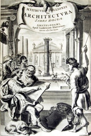
A couple thousand years ago an architect named Vitruvius wrote a book about architecture called “De Architectura”, known today as “The Ten Books on Architecture”.  In this book he describes three elements that are necessary for a building to be successful; “firmitas, utilitas, venustas”, or “firmness, commodity and delight”.  In other words, the building must be structurally sound (firmness), functional (commodity) and beautiful (delight).  Through the ages, these three elements have stood the test of time.  They are inseparable.  I believe a building is truly successful when it exceeds the user’s expectations in all three categories.  But of the three, beauty is the one that people love to talk about the most.  It’s not just the exterior of the building, but also the spaces within that make the difference between a good building and one that is exciting and makes you want to go inside.   Even Frank Lloyd Wright paraphrased Chinese philosopher Lao Tzu when he said “The space within becomes the reality of the building”.  (See photo of Wright’s Guggenheim museum at right). 

We’ve all heard that “Beauty is in the eye of the beholder”.  This, of course, is true of many things.  What does beautiful architecture mean to you?  Why do you like some spaces and not others?  What draws you to a building or a space?  What would make buildings better?

gehry-right-05.jpg

Welcome to The Collaborative Forum, a periodic blog expressing ideas and views on architecture, cool spaces and the built environment.  Periodically we will present vignettes from a variety of building types and spaces around the world as well as from TKC Architects.  But what we want to know is this: what is your favorite building? Was it a house, a church, a theater?  Tell me what you liked best about it and how you felt when you were inside.  You don’t have to be a professional to share an opinion – architecture is for everyone to enjoy.  We really want to know what you think.


 Richard Emerson Kaufman is an Architect/Chief Visionary Officer of The Kaufman Collaborative Architects.  Experienced in residential, commercial and institutional architecture.  Kaufman is committed to helping clients find creative, workable solutions that are cost effective and environmentally responsible.

Star Wars Has Landed by Justin Fuqua

Floating Wall as seen from the Foyer.  The Great Room including the Dining Room table is on the other side of the wall. 

Floating Wall as seen from the Foyer.  The Great Room including the Dining Room table is on the other side of the wall. 

It was kind of a fluke really.  The first time I met with the clients of the pavilion house I noticed a beautiful kimono displayed in their living room.  I was mesmerized with it’s simple pattern and especially they way the kimono was displayed.  The kimono reflected my client’s heritage

“That is so beautiful” I said.  “You need to display it in a very prominent part of the house”.

“How about at the front entry” she suggested.  “Make a floating wall or something”. 

“What’s a floating wall?” I asked.

“I don’t know” she said.  “That’s your job.  You figure it out”. 

It didn’t take long to put all the pieces together.  I wanted something unusual and somewhat exciting to greet visitors as they walked through the front door.  It needed to serve many purposes and stand alone as an iconic feature in and of itself.   It also needed to express open and flowing spaces, one of the main concepts for the house.  The Great Room with the Media, Dining and Kitchen were on the other side from the Foyer and needed to be partially shielded.  (I wanted the visitors to get a peek of what was beyond and draw them to these spaces while not completely revealing what was on the other side).  Placing a wall at the end of the open hallway between the Foyer and Great Room would satisfy these requirements.  But it couldn’t be just a simple floor to ceiling wall.  Additionally, the other side of the wall needed to include storage and small buffet platform to serve the adjacent dining table. 

The Great Room side of the Floating Wall containing storage and a small buffet platform serving the dining room table.The Foyer and entry doors can be seen to the right, beyond.   

The Great Room side of the Floating Wall containing storage and a small buffet platform serving the dining room table.The Foyer and entry doors can be seen to the right, beyond.   

I love curves in architecture.  They add a spirit to the place which is quite different than that seen in spaces where no curves exist.  I try in incorporate them in every project I design and decided to curve the wall in the direction of travel from the Foyer.  This gave a person an opportunity to walk to the left or the right.  (It also has a slight arch at the top).  To reveal some of the space beyond I limited the height of the wall to 7 feet and made the width a maximum of 11 feet wide.  These dimensions satisfied the open feeling I was after. 

A “landspeeder” from the original Star Wars movie

A “landspeeder” from the original Star Wars movie

I had the wall, but it needed to “float”.  I raised the bottom 12” off the stained concrete floor to allow space to flow under as well as over and around the wall.  The wall was nearly complete, but I needed to hide the two 3 ½” square steel columns that supported the structure.  I remembered a desert scene in the very first Star Wars movie where a “landspeeder” hovered a foot or so off the desert floor.  When it came to a stop I had noticed the space underneath shook a little bit.  Yep – they used a mirror angled towards the ground just enough to give the illusion that it was truly hovering!  We carefully cut small pieces of mirrors and angled them with mitered corners to fit around the steel columns so that it would be difficult to distinguish them from the surrounding floor.  To finish the wall, I placed indirect lighting on the underside, so the wall would truly “float” at night.

For the many years my clients enjoyed living in the house, their visitors would scratch their heads and ask “How does that thing stand up?”

Think “Star Wars”.

_____________________________________________________________________________

Richard Emerson Kaufman is an Architect/Chief Visionary Officer of The Kaufman Collaborative Architects.  Experienced in residential, commercial and institutional architecture.  Kaufman is committed to helping clients find creative, workable solutions that are cost effective and environmentally responsible.